Building plots from sourmash compare output
Running this notebook.
You can run this notebook interactively via mybinder; click on this button: ![]()
A rendered version of this notebook is available at sourmash.readthedocs.io under “Tutorials and notebooks”.
You can also get this notebook from the doc/ subdirectory of the sourmash github repository. See binder/environment.yaml for installation dependencies.
What is this?
This is a Jupyter Notebook using Python 3. If you are running this via binder, you can use Shift-ENTER to run cells, and double click on code cells to edit them.
Contact: C. Titus Brown, ctbrown@ucdavis.edu. Please file issues on GitHub if you have any questions or comments!
Running sourmash compare and generating figures in Python
First, we need to generate a similarity matrix with compare. (If you want to generate this programmatically, it’s just a numpy matrix.)
[1]:
!sourmash compare ../tests/test-data/demo/*.sig -o compare-demo
== This is sourmash version 4.8.5.dev0. ==
== Please cite Brown and Irber (2016), doi:10.21105/joss.00027. ==

loaded 7 signatures total.

0-SRR2060939_1.fa...    [1.    0.356 0.078 0.086 0.    0.    0.   ]
1-SRR2060939_2.fa...    [0.356 1.    0.072 0.078 0.    0.    0.   ]
2-SRR2241509_1.fa...    [0.078 0.072 1.    0.074 0.    0.    0.   ]
3-SRR2255622_1.fa...    [0.086 0.078 0.074 1.    0.    0.    0.   ]
4-SRR453566_1.fas...    [0.    0.    0.    0.    1.    0.382 0.364]
5-SRR453569_1.fas...    [0.    0.    0.    0.    0.382 1.    0.386]
6-SRR453570_1.fas...    [0.    0.    0.    0.    0.364 0.386 1.   ]
min similarity in matrix: 0.000
saving labels to: compare-demo.labels.txt
saving comparison matrix to: compare-demo
[2]:
%pylab inline
# import the `fig` module from sourmash:
from sourmash import fig
%pylab is deprecated, use %matplotlib inline and import the required libraries.
Populating the interactive namespace from numpy and matplotlib
The sourmash.fig module contains code to load the similarity matrix and associated labels:
[3]:
matrix, labels = fig.load_matrix_and_labels("compare-demo")
Here, matrix is a numpy matrix and labels is a list of labels (by default, filenames).
[4]:
print("matrix:\n", matrix)
print("labels:", labels)
matrix:
 [[1.    0.356 0.078 0.086 0.    0.    0.   ]
 [0.356 1.    0.072 0.078 0.    0.    0.   ]
 [0.078 0.072 1.    0.074 0.    0.    0.   ]
 [0.086 0.078 0.074 1.    0.    0.    0.   ]
 [0.    0.    0.    0.    1.    0.382 0.364]
 [0.    0.    0.    0.    0.382 1.    0.386]
 [0.    0.    0.    0.    0.364 0.386 1.   ]]
labels: ['SRR2060939_1.fastq.gz', 'SRR2060939_2.fastq.gz', 'SRR2241509_1.fastq.gz', 'SRR2255622_1.fastq.gz', 'SRR453566_1.fastq.gz', 'SRR453569_1.fastq.gz', 'SRR453570_1.fastq.gz']
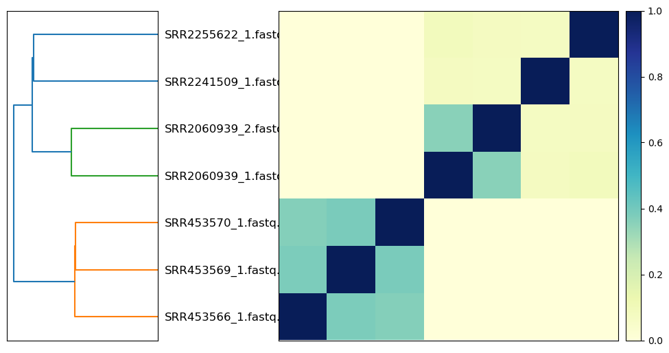
The plot_composite_matrix function returns a generated plot, along with the labels and matrix as re-ordered by the clustering:
[5]:
f, reordered_labels, reordered_matrix = fig.plot_composite_matrix(matrix, labels)
[6]:
print("reordered matrix:\n", reordered_matrix)
print("reordered labels:", reordered_labels)
reordered matrix:
 [[1.    0.382 0.364 0.    0.    0.    0.   ]
 [0.382 1.    0.386 0.    0.    0.    0.   ]
 [0.364 0.386 1.    0.    0.    0.    0.   ]
 [0.    0.    0.    1.    0.356 0.078 0.086]
 [0.    0.    0.    0.356 1.    0.072 0.078]
 [0.    0.    0.    0.078 0.072 1.    0.074]
 [0.    0.    0.    0.086 0.078 0.074 1.   ]]
reordered labels: ['SRR453566_1.fastq.gz', 'SRR453569_1.fastq.gz', 'SRR453570_1.fastq.gz', 'SRR2060939_1.fastq.gz', 'SRR2060939_2.fastq.gz', 'SRR2241509_1.fastq.gz', 'SRR2255622_1.fastq.gz']
Customizing plots
If you want to customize the plots, please see the code for plot_composite_matrix in sourmash/fig.py, which is reproduced below; you can modify the code in place to (for example) use custom dendrogram colors.
[7]:
import scipy.cluster.hierarchy as sch


def plot_composite_matrix(
    D, labeltext, show_labels=True, vmax=1.0, vmin=0.0, force=False
):
    """Build a composite plot showing dendrogram + distance matrix/heatmap.

    Returns a matplotlib figure.

    If show_labels is True, display labels. Otherwise, no labels are
    shown on the plot.
    """
    if D.max() > 1.0 or D.min() < 0.0:
        error(
            "This matrix doesn't look like a distance matrix - min value {}, max value {}",
            D.min(),
            D.max(),
        )
        if not force:
            raise ValueError("not a distance matrix")
        else:
            notify("force is set; scaling to [0, 1]")
            D -= D.min()
            D /= D.max()

    if show_labels:
        pass

    fig = pylab.figure(figsize=(11, 8))
    ax1 = fig.add_axes([0.09, 0.1, 0.2, 0.6])

    # plot dendrogram
    Y = sch.linkage(D, method="single")  # centroid

    Z1 = sch.dendrogram(
        Y,
        orientation="left",
        labels=labeltext,
        no_labels=not show_labels,
        get_leaves=True,
    )
    ax1.set_xticks([])

    xstart = 0.45
    width = 0.45
    if not show_labels:
        xstart = 0.315
    scale_xstart = xstart + width + 0.01

    # re-order labels along rows, top to bottom
    idx1 = Z1["leaves"]
    reordered_labels = [labeltext[i] for i in idx1]

    # reorder D by the clustering in the dendrogram
    D = D[idx1, :]
    D = D[:, idx1]

    # show matrix
    axmatrix = fig.add_axes([xstart, 0.1, width, 0.6])

    im = axmatrix.matshow(
        D, aspect="auto", origin="lower", cmap=pylab.cm.YlGnBu, vmin=vmin, vmax=vmax
    )
    axmatrix.set_xticks([])
    axmatrix.set_yticks([])

    # Plot colorbar.
    axcolor = fig.add_axes([scale_xstart, 0.1, 0.02, 0.6])
    pylab.colorbar(im, cax=axcolor)

    return fig, reordered_labels, D
[8]:
_ = plot_composite_matrix(matrix, labels)

[ ]: